How to Advertise on Facebook + Strategies [Complete Guide]

Table of Contents
As the largest social media platform, Facebook continues to be the most used network among marketers. That said, the decline in organic reach is posing a challenge for brands. In fact, Facebook has a significantly lower organic engagement compared to Instagram. And most of the content that people see on the platform comes from friends and accounts they follow.
To get around this, marketers are using Facebook ads to get their brand in front of the right audience. If you’re new to social media advertising or advertising on Facebook, this guide can help. Let’s find out how to create Facebook ads and strategies for using them.
Why should you use Facebook ads?
Not sure why you should use Facebook paid ads? Here are some of the key benefits you can enjoy from advertising on Facebook and creating a targeted strategy.
Potential to reach a massive audience
With almost 3 billion monthly active users, Facebook still holds steady as the biggest social media platform. Since it attracts such a massive user base, it gives you the opportunity to bring loads of exposure to your brand.
Ability to fine-tune your targeting
Facebook’s ad targeting capabilities are one of the best in the industry, but staying effective requires adapting to the latest Facebook advertising trends focused on privacy and first-party data.
By default, the platform will show your ad to users who are most likely to be interested in it. But you can further fine-tune your targeting based on:
- Interests, geography, age and plenty of other factors
- Past engagement with your business
- Similarity to your best customers

Access to robust ad analytics
Facebook’s analytics gives you comprehensive insights into your ad performance. You can use this to track your performance in real-time. It even lets you generate customized reports based on the metrics that matter to you.
How to create Facebook ads
Follow the steps below to start including ads in your Facebook marketing strategy.
Remember: A Facebook ad is nothing if it’s not executed strategically. Use this template to get clear on the goals driving your Facebook advertising approach. It will take you through the questions you need to consider before launching your next brand campaign on Facebook Ads.
Step 1: Create your Facebook ad account
To start running ads on Facebook, make sure you have an active Facebook business Page. Alternatively, you can run ads as an admin, advertiser or editor for someone else’s page.
You’ll then have to set up an ad account from where you can create and manage your campaigns. To do this, go to the Ads Manager and confirm your info on the setup page. Then add a verified payment method to start creating ads.
Step 2: Define your Facebook advertising target audience
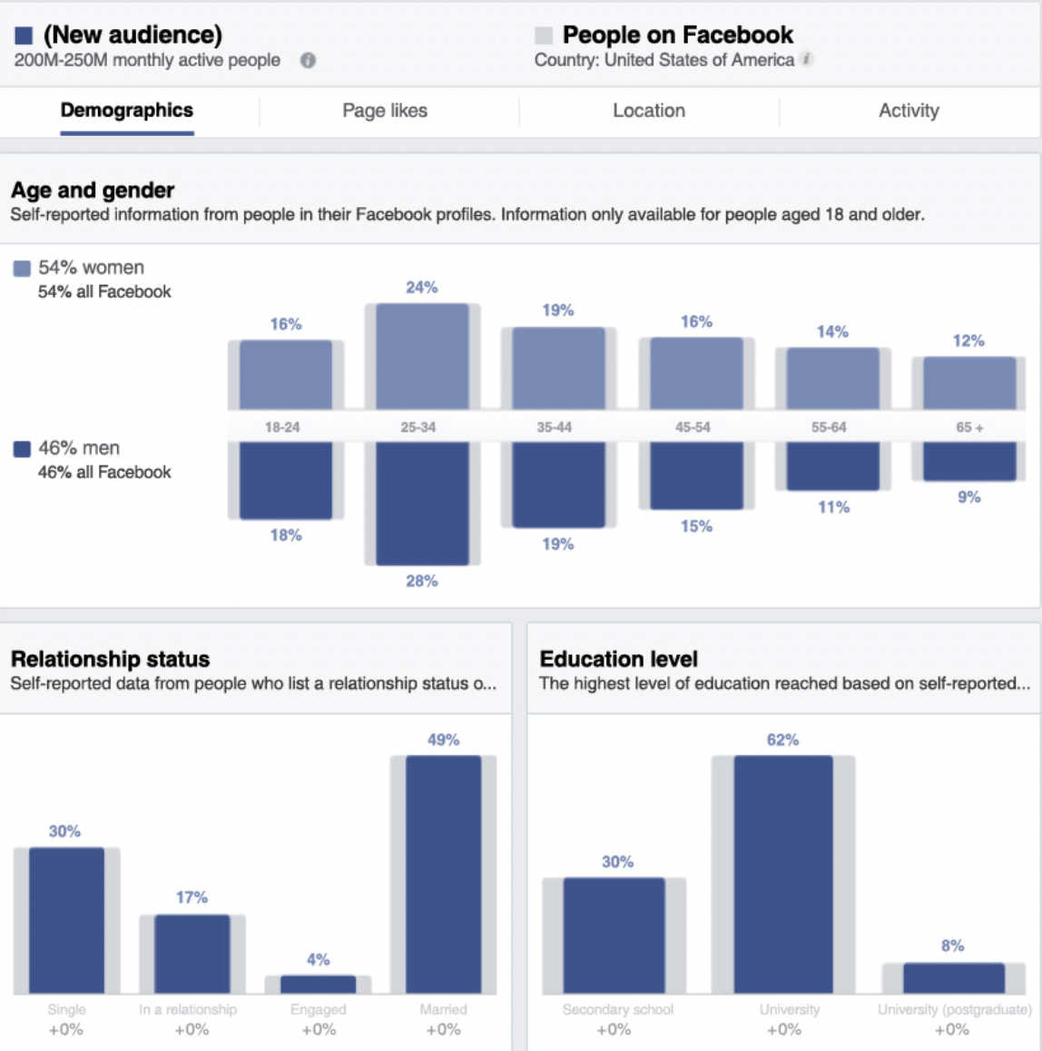
As mentioned earlier, Facebook’s biggest draw is the ability to get highly specific with your targeting. It allows you to get really granular with your targeting and show your ads only to people who are most likely to be interested. Here’s a quick breakdown of the different ways you can target your Facebook ads.
Defining your core audience
For starters, use Facebook to create ad audiences from scratch. Businesses can define audiences based on specific parameters such as:
- Location: To target people in a specific location. For example, local businesses can target the people living in their city
- Age: To target people within a specific age range. If your audience has a broad age range, you can segment your ads accordingly rather than take a one-size-fits-all approach
- Interests: To target people based on their “likes” and Facebook activity. For example, a local bike shop may target users following Schwinn’s brand page or list “biking” as an interest
- Demographics: To target people based on demographic details. This includes details such as education level or relationship status. This way, you can find specific social media personas that resemble your real-life customers.

Building a Custom Audience
Also known as remarketing ads, Custom Audiences can be a game-changer for your Facebook ad strategy. Simply put, these types of ads target members of your audience who’ve interacted with your business in the past. Maybe they’re former or current customers. Perhaps it’s someone who engaged with your Facebook page or visited your site.
With the help of tools such as Facebook Pixel, businesses get a sort of “second chance” to win over leads who already know who they are. Here’s a snapshot of the different sources you can use to create a Custom Audience.

Creating a Lookalike Audience
Lookalike Audiences empower businesses to target new prospects based on their current customers. In short, you can target a Facebook audience that resembles your most loyal customers. If you’re planning to focus on prospecting and awareness, Lookalike Audiences are for you.

Step 3: Pick the right types of Facebook ads
Businesses are spoiled for choice when it comes to choosing the types of ads they produce. Facebook lets you choose between six different objectives for your campaign:
- Awareness – to increase your reach and introduce your business to potential customers via Facebook ads
- Traffic – to get people to click on your link and visit a specific destination on your site
- Engagement – to get people to engage with your brand by interacting with your post, watching your video, liking your Page or sending you a message
- Leads – to collect high-quality leads for your business
- App promotion – to get more people to discover and install your app
- Sales – to reach people who are most likely to buy your product or service

These objectives will ultimately determine the direction you take with your ads, including your ad types and ad creatives. For example, let’s say you choose Leads as a campaign objective. This will give you the option to display instant forms, call buttons and Facebook Messenger buttons alongside your ad.
Facebook currently offers six different ad formats:
- Image ads – using a single image of your product or brand
- Video ads – promote your brand using an audio-visual format
- Carousel ads – display up to 10 images or videos in one ad. Each media file can have its own link
- Instant Experience ads – display your ad in a full screen once someone taps on it using the Facebook mobile app
- Collection ads – feature multiple products in a single ad. When someone interacts with the ad, it will open as an Instant Experience
Step 4: Sort out your creatives for ads on Facebook
Chances are you already have some ad creatives and sleek product photos on deck, right?
That said, what clicks with customers on Facebook is surprisingly specific. Here are some key creative tips for your Facebook advertising strategy.
Don’t neglect entertainment value
Being boring is a kiss of death for any ad campaign and Facebook is no different. The more entertaining you make your ads, the less they feel like, well, ads. Whether it’s humor or imagery that catches people’s eyes, strive to avoid static, stuffy campaigns.
If possible, use video
You’ve heard it a thousand times, but it bears repeating: video content is totally crushing it right now. In fact, short-form video came out on top as the most engaging type of in-feed social content in The 2022 Sprout Social Index™.

Videos are capable of showing off your ads in action, perfect for both raising awareness and grabbing users’ attention. Oh, and don’t forget that Facebook has explicitly encouraged brands to get on board with video in the wake of its algorithm shift.
Think of a video ad as a sort of mini commercial for your brand. Stopping scrollers in their tracks, video is fair game for just about any business.
Come up with a compelling call-to-action
Any sort of engagement is a plus with your Facebook ads, but ultimately, you’re on the hunt for clicks. To make those clicks happen, you need a strong call to action. Keep it simple and direct, while ensuring that it’s relevant to the ad.
Step 5: Test and track your campaigns for ads on Facebook
Before you jump knee-deep into your Facebook ad strategy, you need to figure out how to navigate the platform first.
And yeah, there’s definitely a learning curve involved.
With so many metrics and Facebook KPIs to track and watch, we don’t blame any marketer for getting a bit overwhelmed. This is exactly why we encourage newbies to run smaller test campaigns to get their feet wet. So you can make adjustments before blowing out your budgets.
Facebook now gives you the option to turn on A/B testing for your ads. This is a great way to experiment with different variations of your ad creative, ad copy and target audience to see which one performs the best.

Speaking of budgets, Facebook can serve your ads for you based on what it perceives as “optimal” engagement or based on a set schedule. There is no “right” answer for how to budget, just know that you can quickly drain your dollars if you don’t set restrictions. Turn on the “Advantage campaign budget” option to make optimal use of your advertising dollars.
Another key advantage of advertising on Facebook is the platform’s reporting features. Again, Facebook gets incredibly granular in terms of what you can track. If you want to figure out if you’re getting a positive ROI or relevant click, look no further than your reports. Tracking specific events, reach and amount spent, you have a wealth of data at your fingertips to figure out what’s working and what’s not.

To effectively test and track your campaigns, you’ll need to go beyond the built-in options, which is where these dedicated Facebook analytics tools can make all the difference.
Step 6: Combine paid campaigns with organic activity
In most cases, it’s in the best interest of businesses to adopt a hybrid social media strategy.
This would involve organically engaging customers through content and community-building. At the same time, you’ll be supplementing your efforts with paid campaigns. Doing so gives you the best of both worlds.
Although organic reach has gone down, that’s no excuse to abandon Facebook. Neither is it a good reason to neglect the potential of employee advocacy or customer service to connect with customers. Paid ads may encourage conversions and help you drive sales. But you still need organic activity to build relationships and familiarity with your brand.
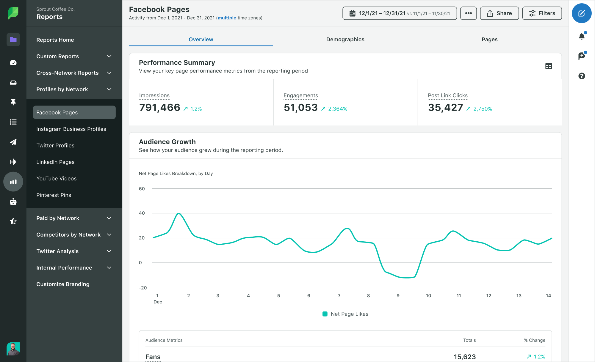
Tools such as Sprout’s analytics make it easier to track how you’re doing on Facebook for both your paid and organic campaigns alike. Here’s a snapshot of how Sprout simplifies and highlights the success of your hybrid strategy.

Sprout’s paid performance reports let you visualize how your paid campaigns are doing without getting into the weeds. This serves as a quick diagnosis of your Facebook advertising strategy and whether or not you’re seeing growth.

What is the real cost of Facebook ads?
The specifics are a little complicated, but the short answer is…it depends. The cost to advertise on Facebook is typically customizable according to your budget. That is, Facebook will let you run ads to get optimal results based on how much you can afford to spend.
According to the latest data from Revealbot, the average CPC (cost-per-click) for Facebook ads is around $0.79. That means you’d be spending around $79 to generate 100 clicks. Keep in mind, however, that factors like seasonality and competition will influence the exact cost to win an auction bid on Facebook.

Best practices for Facebook advertising
Now that we’ve covered the basics, it’s time to get into the nitty-gritty. Check out these best practices that will help you create better, more impactful Facebook paid ads.
1. Design your creative with Facebook ad specs in mind
Imagine seeing an ad that looks way too stretched out and doesn’t even show the product properly. You want to make sure that your Facebook ads don’t look distorted in any way, shape or form. So make sure you’re designing your ad creative keeping in mind the latest Facebook ad specs.
2. Create compelling ad copy
An eye-catching ad creative may be enough to capture your audience’s attention. But that’s essentially where its purpose ends. What drives people to click or interact with your ad is the copy.
Your Facebook ad copy should be able to sell the benefit of your offer to the audience. It should make them understand why this is such a good product and why they should take action now.
3. Consider using social proof
Whether it’s a review or a photo of a real customer using your product, social proof can work wonders for your ad.
If it’s someone’s first time seeing your ad, they may be skeptical about it. Give them a good reason to trust your brand by showing social proof in your Facebook ads. This can be in the form of reviews, testimonials, customer photos and videos or even stats.
4. Test different ad variations
If you’re new to it, Facebook advertising can be quite tricky. And no one will blame you if you didn’t get it right your first time. That’s why the best thing you can do is to test different variations of your ad to see what works best.
You could test different variations of your ad creative and ad copy. Or you could experiment with different targeting options, ad types and ad placements. This will help you fine-tune your Facebook advertising strategy to deliver the most impressive results.
Facebook ad examples to inspire your strategy
Best practices aside, the best way to learn is through examples. So here are a few excellent examples of Facebook ads that can inspire your next campaign.
Taboola

What makes it great:
- Eye-catching imagery
- Uses a fun font to highlight keywords
- Highlights the potential i.e., reaching 500 million daily active users
- CTA focuses on a clear benefit
Udemy

What makes it great:
- Highlights baseline price in the copy
- Showcases different offerings in a carousel
- CTA focuses on an offer
Sephora

What makes it great:
- Promotes one specific line of product that’s new to the store
- Uses high-quality imagery
- Highlights different key benefits in a carousel
Using Facebook ads for exponential growth
Facebook’s massive reach and powerful targeting tools make it one of the best platforms for advertisers. With the right strategy and the right tools, you can use Facebook ads to grow your reach exponentially and attract new customers. Find out how Sprout’s Facebook integration can help you achieve that goal.


Share