15 inspiring social media landing page examples

Written by Brent Barnhart
Published on February 26, 2020
Reading time 10 minutes

Landing pages are easily one of the most important pieces of your social media marketing strategy, but they’re unfortunately easy to overlook.
That’s because marketers are often so laser-focused on attracting customers and followers.
However, what happens to those customers once they click through your promotions? Are they moving through your funnel or are you letting those precious clicks go to waste?
If you’re not 100% sure whether your landing pages are up to snuff, don’t sweat it.
We’ve put together a comprehensive list of social media landing page examples and best practices to inspire you and help boost your conversions.
What is a landing page used for, anyway?
Before we get into the nitty-gritty, let’s break down what a landing page is.
A landing page is a destination page that’s part of a specific marketing campaign or promotion.
When your followers or subscribers click through a promotional link (think: social bio, email link), a landing page is quite literally well, they, land.
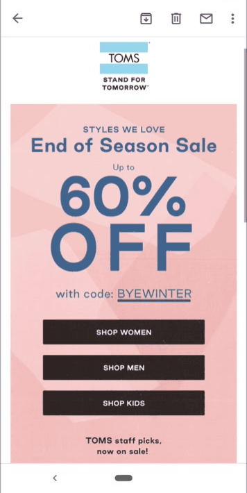
Here’s a straightforward example from a TOMS email promo. Upon clicking through the coupon, we’ve brought to the shopping page that’s specific to the promotion in the email.
Note that landing pages are different than generic homepage links. Generally, landing pages include some sort of specific call-to-action such as signing up for a list or purchasing a particular product.
These pages work to guide visitors to take action rather than just “browse.” Also, tracking promotions with landing pages make it easier to attribute behaviors and metrics. This might include clicks, purchases, time spent on page and bounce rate.
Let’s look at a social media landing page examples from Skullcandy. Their trackable Bitly link in their Instagram bio points to a landing page for a particular product. Rather than point visitors to their homepage, they use their Instagram to highlight their latest offer.

After clicking through, customers land on a page for that offer.

See how that works? Brands typically create new landing pages for product launches and new promotions. Over time, companies can understand what types of content and tactics perform well and can more quickly roll out new landing pages by plugging in new copy and creatives.
What makes a “good” landing page?
Hey, “good” question!
Businesses have tons of creative freedom when it comes to putting together their landing pages.
That said, there are some common threads between top-performing pages which we’ve highlighted below.
A good landing page guides visitors from Point A to Point B
No secrets here. Ideally, your landing page should keep visitors reading (and scrolling) as they naturally want to learn more and eventually click through your call-to-action (CTA).
Through elements of design, copy and CTA placement, brands manage to keep readers glued to the page without losing interest.
Below’s a good example from Zenni. The landing page is naturally broken up into sections, with attractive icons and photos of actual people to hold the reader as they educate themselves on the company’s offer.

Rather than hit readers with a wall of text, brands are tasked with coming up with landing pages that find a balance between education, entertainment and usability.
A good landing page isn’t too “busy”
Piggybacking on the last tip, landing pages are the last place you want to overwhelm people via information overload.
Landing pages typically follow the rule of “less is more.” You’ll notice that many of them are minimalist when it comes to copy and color schemes, using only a couple of colors and brief copy to make their offer easy to digest at a glance.
For example, this landing page from Host Gator is a great piece of landing page design inspiration. The page’s rapid-fire points are coupled with a blue and orange color scheme that makes their CTA can’t miss while also being easy on the eyes.

A good landing page is mobile-friendly
Conventional wisdom tells us the majority of web and social traffic is mobile.
Meanwhile, recent social media statistics point to the need to appeal to customers on-the-go.
That’s why your landing pages should be mobile-friendly by default. Responsive design can take care of some of the legwork for you, but any social media landing page in particular needs to be scroll-friendly. The previous two tips can help make that happen.
That doesn’t mean you have to make your landing pages bare-bones, though. For example, this social landing page from Xero is effective while still including product screenshots, video and animations.

15 social media landing page examples (and why they work)
Now, onto the good stuff!
Below are some of the best landing page examples from social media broken down by industry.
And although many of these landing pages look totally different, they manage to get the job done in terms of driving clicks. No matter what you’re selling, these examples can inspire you.
Ecommerce landing pages
As highlighted in our guide to social media for retail, ecommerce landing pages should make the purchasing possible as direct and painless. Your end-game here is to guide shoppers to relevant product pages ASAP.
1. Black Milk Clothing
The beauty of a shoppable feed is that it makes the process of selling on Instagram a cinch. That’s the approach Black Milk takes, with its Instagram landing page serving as a feed of promos and user-generated content. Also, note the email opt-in to gather more information from prospective shoppers.

Not necessarily unique to our other landing page examples, this one also featured a discount pop-up for first-time visitors. Although the use of pop-ups is hotly debated, free shipping pops are still all-the-rage for ecommerce in particular.

2. Liingo
This landing page for a desktop Facebook ad from Liingo is brilliantly designed, separated into three sections as we scroll through. Note the bright orange call-to-action buttons as well as the animation from the “Virtual Try-On” section, both serving to catch the eyes of anybody scrolling through.

3. Beardbrand
Anything you can do to make your landing pages interactive is a plus. That’s exactly what Beardbrand does with its quiz-based landing page.
Upon gathering your email address, the quiz dives into questions to help guide you toward the right products.

Although a quiz might require a bit of legwork on the part of shoppers, taking the time to do so results in personalized product recommendations that require less browsing. Note also that by going through a quiz, your leads provide audience insight by giving you responses about their personal preferences. In short, a win-win.
SaaS landing pages
A crucial piece of any SaaS marketing strategy, landing pages should be straightforward in that they encourage visitors to download or request a demo. However, landing pages for SaaS aren’t always that simple.
4. Sprout Social
Sprout’s Facebook ad landing page is far from suit-and-tie. Featuring a friendly face above-the-fold and language that emphasizes our values and need for connections, we’re looking to prove to prospects that we’re about more than just software.

The green CTA buttons are easy to see here. Meanwhile, video is noted to boost engagement and conversions and is why you’ll see it throughout our landing page examples.
5. Salesforce
Another Facebook ad landing page, Salesforce does a good job of breaking down exactly what their product does in plain English.
Coupled with imagery, actual screenshots and testimonial video below the fold, this landing page does a little bit of everything while providing essential information up-front.

6.Hyke
This Instagram ad landing page presents Hyke as a helpful tool, highlighting money saved without mincing words.
The remainder of the landing page includes social proof, testimonials and crystal clear pricing, while the purple CTA is can’t-miss.

Hospitality and travel landing pages
Simply put, social media for travel is all about scoring bookings. These landing pages highlight how some of the biggest players in the travel industry make it happen.
7. Southwest
Coming from a Twitter video ad, this Southwest landing page is about as simple as they come.
But again, landing pages doesn’t need to be inherently complicated. Shouting “Hey, we’ve got good rates!” with a single, bright call-to-action that helps draw the reader to the natural conclusion to click-through.

8. Four Seasons
If you’re in the travel industry, you know that style points matter. This Instagram landing page from the Four Seasons is minimalist but bold, offering clear call-to-actions which contrast with the rest of the landing page’s text.

9. Disney Vacation Club
Well-organized and stylish, Disney’s landing page features videos and accommodation highlights for visitors who want to learn more than what’s above-the-fold.

Landing pages for courses, courses and guides
From freebies to paid courses, these types of landing pages typically highlight benefits and present themselves as being time-sensitive.
10. Foundr
Foundr’s course landing page sort of feels like an old-school sales page but with some bells and whistles that make it more effective. For example, the offer countdown timer is a classic example of urgency marketing that still works today. Note also its use of video.

Coupled with a ton of data, social proof and testimonials below-the-fold, this busy landing page succeeds in selling itself to skeptics.
As an aside, Foundr promotes the course with a pinned tweet: a smart move for any business looking to promote a static or long-term office while still linking to their homepage via social.

11. Shopify
This landing page represents a style we see quite often for e-books, but this time-tested format works.
Sitting atop accompanying stats and data points, downloading Shopify’s guide doesn’t require any digging here. You know exactly what you’re getting and where to find it.

12. Skillcrush
If you’re promoting a webinar, perhaps the most important piece of your landing page is reinforcing the date and time. Skillcrush manages to do this while also highlighting its host with a human touch. The title and tagline of the webinar are all that’s really necessary to seal the deal for sign-ups.

Charity and nonprofit landing pages
Although social media for nonprofits is less about selling per se, landing pages for charity organizations are centered around driving donations. Here’s how they do it.
13. charity: water
The counter that’s front-and-center here helps highlight who’s contributed, serving as a sort of bandwagon effect for new donors. The clear, static donation box is also a nice touch. A simple color scheme and long-form video make this a clean, professional landing page that gets the job done.

14. UNICEF USA
Not unlike a shoppable Instagram feed, this landing page allows visitors to browse and donate products that correlate with different photos. This is a creative way to encourage donations while also double-dipping your charity-related content.

15. Greenpeace
Stunning imagery and a bright, static opt-in form make this landing page visually striking. The “signatures so far” bad is also a subtle touch to encourage visitors to get involved.

As you can see, there’s a lot of room for creativity when it comes to these landing pages examples. This serves as good news as you can format and design your page based on your brand, all the while ticking the boxes of what makes a page “good”
How to optimize landing pages over time
Feeling inspired and ready to freshen up your landing pages?
Awesome! Your head is in the right place.
But before you consider scrapping your current pages or coming up with new creatives or copy, it’s important to understand what landing page optimization actually looks like.
To wrap things up, let’s talk about how to come up with a baseline for landing page performance and what you can do to give your numbers a must-needed boost.
Track the behavior of your landing page traffic
For starters, start by seeing which of your landing pages are performing well via Google Analytics.
Which pages are consistently attracting new visitors? Is there a specific call-to-action or page which drives the most clicks. You can not only set such goals in GA, but also monitor them over time to make sure they’re ticking upward.
Regardless, having this data available allows you to set expectations and goals as you look to improve your conversion rate.

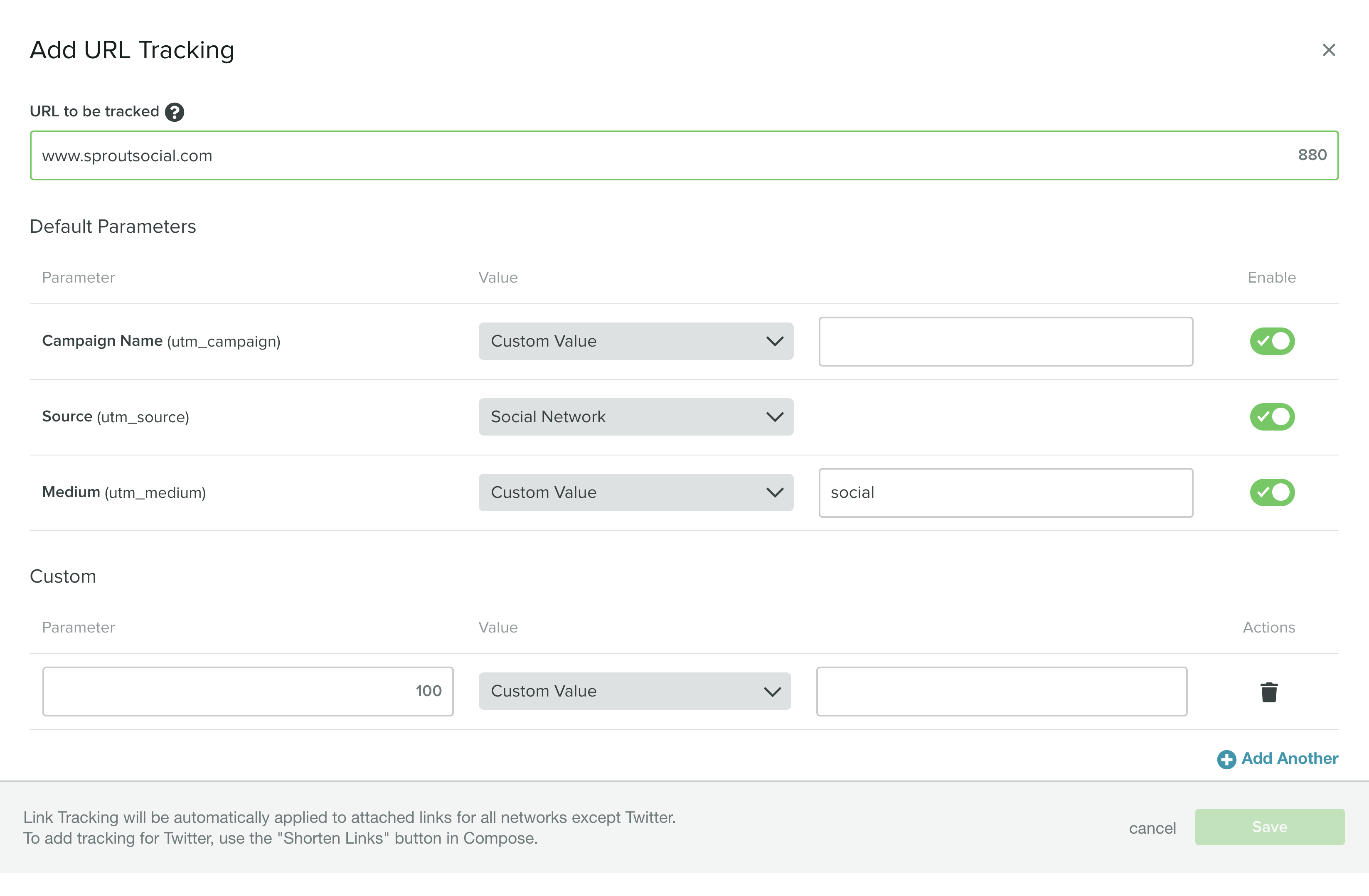
Also, tools such as Sprout Social can assist in monitoring clicks and conversions via your social media landing pages. With our URL tracker, you can identify and gather analytics for social-specific links. This includes not only bio links but also specific posts and promotions.
A/B test your landing pages
Let’s say you’re ready to roll out a new landing page or want to make some changes to an existing one.
Maybe you want to try a new call-to-action or button placement. Perhaps you want to switch up your color scheme.
With tools like Unbounce, you can start with proven landing page templates and optimize them to your liking. You can also run multiple versions of the same page side-by-side, allowing you to A/B test them to see which one is the “winner.” Regular testing does double duty of refining your pages over time while also ensuring that you’re meeting your own standards in terms of performance.

Make sure your creatives and copy are consistent
A quick tip, but definitely worth mentioning!
Double-check that your and marketing messages are consistent not only across landing pages but also across marketing channels.
For example, creatives (think: imagery, calls-to-action, promotions) should ideally be consistent on your homepage, email and social platforms.
This ensures that your traffic is being sent where they’re supposed to be and likewise isn’t cause for confusion. Someone clicking through an autumn offer shouldn’t wind up on your summer landing page, right?
And with that, we wrap up our guide!
Ready to build better landing pages for your promotions?
Listen: there’s one “right” way to put together a winning landing page.
However, it’s key to understand what effective ones look actually like in the wild.
Hopefully, this list of landing page examples and best practices can help you start brainstorming your next destination page. Any landing page tips or tricks you’d like to share with our readers? How have you increased your conversion rate? Let us know in the comments below!
If you’re looking for a simple solution to organizing and reporting on your social marketing success, check out our toolkit of social templates to level up your day-to-day.
37 free social media strategy templates that will elevate your workflows
Published on December 5, 2025 Reading time 15 minutes
Share