Your ultimate guide to social media icons
Social media has become so ingrained in our daily lives that most social media icons are instantly recognizable. You don’t need to see the name of the platform to associate the blue “f” icon with Facebook or the retro camera icon with Instagram. Most people also know what would happen if they click on those icons when they see them on a website or email.
For marketers and business owners, this offers an excellent opportunity to implement social media icons into their marketing strategies. You can add them to your home page, blog posts, emails or even marketing collateral.
At the same time, there’s a lot that you should consider before you use these social media logos including the best practices and legal conditions. It’s important to remember that social media icons are also the respective company’s registered trademarks. This means they have copyright protection, so you can’t do whatever you want with them.
In this post, we’ll discuss the best practices to legally use these popular social media icons and where you can find them. You’ll also gain some insight into the importance of using these icons in your marketing strategy and how to use them.
The benefits of using social media icons
Social media icons make it easier for people to find your business on social media, helping you connect with your customers and increase your following. You can add them to your website and digital marketing materials. A lot of businesses also use them in their business cards and physical marketing materials like posters and invitation cards.
When people see social media logos on your print material, they’ll be able to know that your business is on those channels. You’d typically include the relevant social media handle next to the icon, so people can easily find you. In the case of digital logos, they would link to your social media profile and people can just click on one to find you there.
For instance, clicking on any of the following social media icons on the Sprout Social homepage will take you to the company’s respective social media channels.

Using social media icons is a great way to keep everything neat and uniform. Since they’re easily recognizable, people know exactly what happens when they click on a certain icon. Plus, you wouldn’t have to annoy your visitors with intrusive popups asking them to follow you. Now that you have learned about the importance of social media icons, let’s dive into where you can find free social media icons, while also following brand guidelines:
Brand guidelines on social media icons and where to find them
Facebook icons
You can download the approved “f” logo files from the Facebook Brand Resource Center.
- Guidelines
- Only use the “f” logo in the correct color and shape. If there are any technical limitations preventing you from using the official Facebook colors, opt for black and white.
- It should be the same size as all the other icons.
- Do not animate or represent any physical object as the “f” logo.
- Do not deconstruct the logo or modify its design in any way.
Source: Facebook Brand Guidelines
Instagram icons
You can download the approved Instagram icon files from the Assets section of the Instagram Brand Resource Center.
- Guidelines
- Only use the icons from the Instagram Brand Resource Center. You can download versions in multicolor or black and white.
- You have the freedom to replace the color with any solid color.
- All other aspects of the design should remain unchanged.
- Always maintain the icon’s proportions and do not make it smaller than 29X29 pixels.
- You’ll need to request permission if you’re going to use the icons for radio, broadcast, out-of-home advertising or print that’s larger than 8.5 inches X 11 inches. All requests should be in English and should include a mock-up of how you intend to use the icon.
Source: Instagram Brand Guidelines
Twitter icons
You can download the approved icon files from Twitter Brand Resources, along with the complete guidelines to using them.
- Guidelines
- Using the icon without a container is preferable, but you have the option to use it inside a circle, square or square with rounded edges.
- Only use it in Twitter blue or white. In case of color limitations, you can display it in black after getting permission from Twitter.
- If you’re placing it on an image, always use the white logo.
- Do not alter it in any shape or form. This includes skewing or rotating it, filling it with patterns, and adding elements.
- Do not animate or anthropomorphize it.
- Do not surround it with other birds or creatures.
- Only use the most updated version of the logo.
- Do not overemphasize it, but make sure it’s at least 32 pixels wide.
Source: Twitter Brand Resources
LinkedIn icons
You can download the correct icon files from LinkedIn’s Brand Resources, along with the complete usage policies.
- Guidelines
- ‘LinkedIn prefers that you use a solid white background to display its logo. When that’s not possible, you may use a solid light color.
- You should always use the correct color version online. If there are color limitations in print applications, you may use a solid black version.
- The icon should always be in a rounded square container.
- It should be at least 21 pixels tall for online applications or at least 0.25 inches tall in print applications.
- Do not modify or distort any elements including the colors.
- For use on film, television or other video productions, you’ll need to request for permission.
Source: Linkedin Brand Policies
YouTube icons
You can download the approved icon files from the YouTube Brand Resources page.
- Guidelines
- Maintain a clear space of at least half the icon’s width around the YouTube logo.
- In digital content, the logo should be at least 24dp tall. In print, it should be at least 0.125 inches or 3.1 mm tall.
- Never alter the logo in any shape or form. This includes changing the spacing between the letters, replacing the typeface, adding visual effects and changing the shape.
- You can choose from two versions of the full-color logo–white and almost black. Use the first on a dark background and the latter on a light background.
- Do not use any other colors aside from red, white or almost black.
- It should only link back to a YouTube channel.
Source: YouTube Brand Resources
Snapchat icons
You can download the full brand guidelines and approved Ghost logo through Snap Inc.
- Guidelines
- Only use black and white for the logo.
- Do not modify the logo in any shape or form.
- Do not add other characters or creatures around it.
- Use only the versions found in the Snapchat Brand Guidelines Kit.
- Make sure it’s the same size as all other logos.
- It should not be more prominent than your own brand logos and marks.
- It should be at least 18 pixels tall or 0.25 inch.
Source: Snapchat Brand Guidelines
Pinterest icons
You can download the approved Pinterest badge from its Brand Guidelines page.
- Guidelines
- Always use the Pinterest logo in Pinterest red without any alterations, both online and in print.
- Always use it with a call to action that’s proportionate in size to the logo. Use phrases like “Find us on Pinterest,” “Popular on Pinterest,” “Get inspired on Pinterest,” “Visit us” and “Find more ideas on Pinterest.” Never use phrases like “Trending Pins,” “Trending on Pinterest” or any phrase in which “Pin” is used as a verb.
- Always link the icon to your Pinterest URL.
- Do not use the wordmark in place of the logo
Source: Pinterest Brand Guidelines
WhatsApp icons
You can download the approved logo files from the WhatsApp Brand Resources page.
- Guidelines
- Use the green and white logo whenever possible.
- Use the black and white version when the content is mostly black and white.
- Only use the green square logo when you refer to the iOS version of the app.
- Do not modify the logo in any shape or form, or change its colors.
Source: WhatsApp Brand Guidelines
Best practices on how to use social media icons
Using these social media logos the right way can help you establish a strong social media presence. Here are some guidelines and best practices to follow before you use them.
Don’t make any alterations
This is where a lot of brands and marketers fall behind. You can’t make any changes to the logos because they’re registered trademarks. This includes rotating them, changing their colors, animating them or adding elements. Even if the logo colors don’t match your website color scheme, you can always use the monochrome versions like Calendly does in the screenshot below.

Maintain uniform space and size
If you’re using more than one icon, make sure they’re all the same size in terms of height, width and resolution. Each company has specific requirements to maintain a certain amount of clear space between their icon and other elements. Make sure you follow these requirements so each icon has proper visibility.
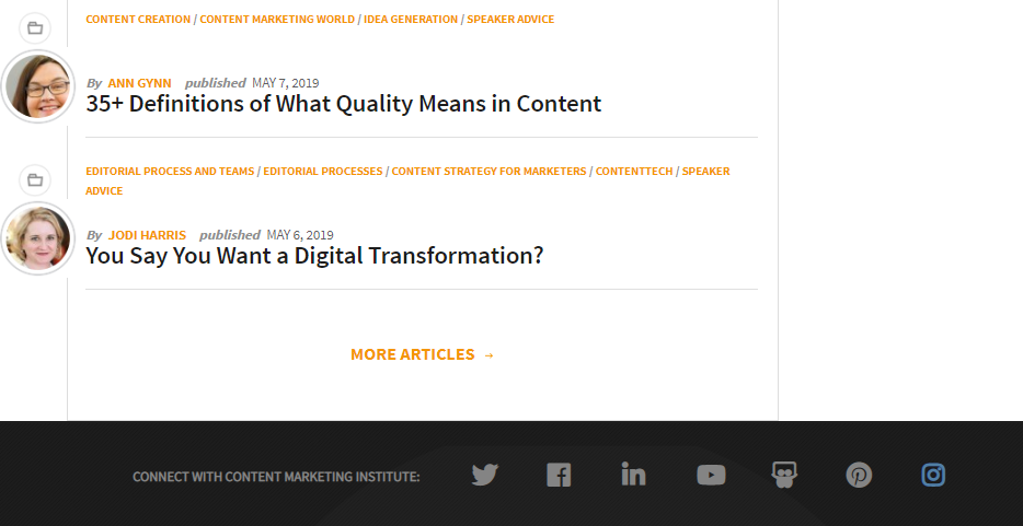
For example, look at how the Content Marketing Institute adds ample space between different social media icons.

Choose a strategic location
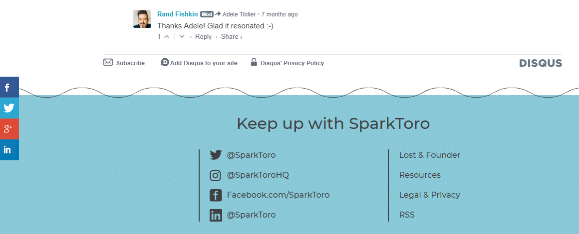
Make sure your social media icons are prominently visible if you want them to have the desired impact. That said, they shouldn’t overshadow your brand either. SparkToro, for instance, adds theirs at the bottom of the page and features their social share buttons within the sidebar. These locations enable users to easily locate and click the icons to share while blending seamlessly into the page experience.

Use them beyond your website
In addition to your website, you can use these social media logos in your videos, marketing collateral, newsletters and emails to increase their impact. This way, you can make sure that more people learn about your brand’s social media and possibly even follow you. For example, take a look at how Sprout adds prominent social media icons at the end of our email newsletters:
![]() The icons are positioned in a prominent place within our newsletter, but also include a call to action to entice the user to connect with us on additional channels.
The icons are positioned in a prominent place within our newsletter, but also include a call to action to entice the user to connect with us on additional channels.
Conclusion
Each social media network has unique rules and requirements for using their brand icons. While we’ve covered the basics in this post, make sure you check out the specifics on each network’s respective resource page. Moving forward, the most important rule to remember is to avoid making any alterations to the icons and to stay up to date on each network’s specific guidelines.
Still figuring out your content strategy? Check out our guide on content marketing to put together the right type of content mix to drive both social and web success.


Share