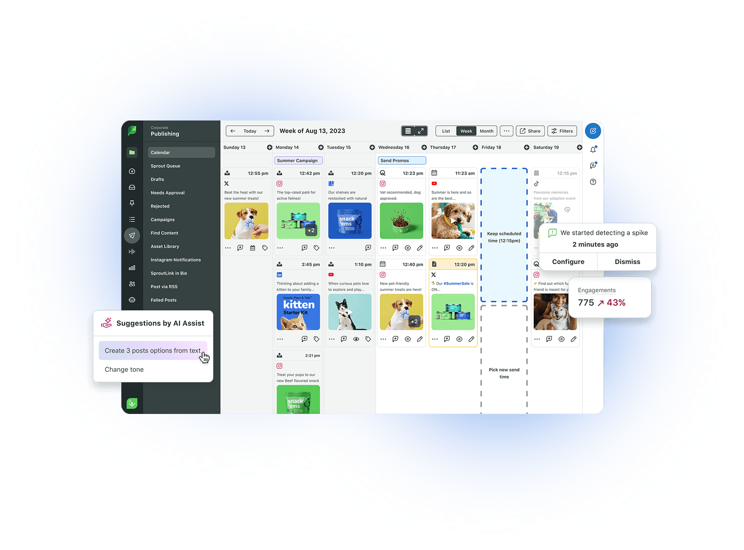
Thoughtful design has always been at the core of everything we do at Sprout Social. From the very beginning, our founders understood that providing a delightful and intuitive user experience is imperative to ensuring our customers’ success on social. And our customers’ success is paramount.

For Sprout, it’s been rewarding to develop and expand our user interface with our customers throughout the years. To deliver a quality product experience, we depend on hearing your feedback. And as time passes and needs evolve, it’s not only important that we modernize our look and feel, but that we also continue to make Sprout even easier for you to use.

Today, we’re thrilled to share Sprout’s design refresh. Over the past several months, many of our customers have upgraded to the new experience and the response has been tremendous. The design refresh is years in the making, and it’s now available for all users on all plans across Sprout’s web and mobile applications.

Highlights of the new experience include: further streamlining your workflows, improving accessibility, providing a more consistent design across the entire platform and setting up a framework to roll out new features, faster. Let’s dig in to learn more.

Why update Sprout’s design?

Investing in this design refresh allows us to continue delivering on one of our core company values to Seek Simplicity, as well as the high standards for intuitive and easy-to-use customer experiences that have always differentiated our product.
Boo Fagan
Director, Product Design

Our goal is to make your job easier. The design refresh won’t change the way you work, it will only make it more effortless. Great design should not only make your workflows more efficient, but also equip you with a more delightful environment to work in.

The new interface maintains that user-friendliness you’re used to, while improving usability and design consistency. And the new consistent design system isn’t only an upgrade to Sprout’s overall look and feel. It also makes it easier for Sprout’s engineers to build and ship new features even faster.

What’s new?

While the new layout may look notably different, the core foundation of the Sprout you’re used to largely remains the same. Likewise, it’s even easier for new users to get up and running because the design elements used across the app are more standardized (e.g. the date picker in Messages will always look and feel like the date picker in Reports).

Visually, the design refresh gives you a more enjoyable environment to work in with a modern layout. Some of the ways we’ve improved our look include:

Less clutter, more focus

You can access the most important areas of Sprout with new, vertical navigation bars on the sides of the app. Names for the tabs and features are hidden, but you can still see them when you hover over the icons. By hiding these names on the surface, we’re reducing some of the clutter from your screen and removing distractions.

Try it out: Hover over the icons on the left and right navigation menus to navigate the new layout.

Doubling down on efficiency, we’ve made it easier to focus on your most important tasks by hiding our filtering and navigation menus. Previously, adjustable filters and menus were always shown on your screen whether or not you needed to adjust them. Now, our filter and secondary navigation menus are now collapsible. Hiding these menus gives you extra screen real estate and lets you quickly access these tools with the click of a button.

Try it out: Go to the Messages tab and toggle the Filters icon in the top right. For even quicker access, use the [ and ] keyboard shortcuts!

DesignRefreshFiltering

Aligning values and design

No matter how you’re accessing Sprout, the new interface should feel polished and easy to use. Which is why we’ve thoughtfully selected new fonts, colors, buttons and icons to improve usability across browser types, phones and operating systems, as well as support users with visual impairments and disabilities. Championing Sprout’s company values of Caring Deeply and Championing Diversity, Equity and Inclusion, we place importance on a smooth and consistent user experience regardless of your circumstances.

The new mobile experience was designed with empathy in mind. We know that our customers use their phones fluidly between work and life scenarios, so we need to be thoughtful about how to provide access to the productivity of Sprout across devices, without being intrusive to a user’s day.
Jing Guo
Staff Product Designer

And our inspiration is…you

As mentioned earlier, the new look is years in the making and inspired by a substantial mix of customer interviews, feedback and user testing. Regularly meeting with our users helps us uncover pain points and build a design that’s even easier to use for all types of use cases. It’s a collaborative effort and the fingerprints of Sprout’s users can be seen in every part of our new interface.

Our inspiration is our users. It’s exciting to be able to take the feedback that we’ve been hearing over time as inspiration to design meaningful and elegant improvements to their workflows and experience.
Bill Foehring
Product Designer

What’s next?

There’s still a lot of room for improvement and we don’t plan on slowing down. These foundational design changes pave the way to continually build and innovate moving forward. Our product roadmap also includes countless plans to improve your user experience beyond the visual changes.

We’re confident—and our early testing has shown—that with a little practice, you’ll love the new design. Please continue to send us feedback on how we can make your job even easier. Sprout has always been built for you, the end user. And now it’s built for better. Enjoy!

See Sprout’s New Look!