Sprout Blog
Sprout Social offers a suite of social media solutions that supports organizations and agencies in extending their reach, amplifying their brands and creating real connections with their audiences.
Featured Research
Editor’s Picks
- Categories
What is predictive media intelligence?
Published on June 18, 2026 Reading time 13 minutes - Categories
Influencer management strategies: How to manage influencers at scale
Published on June 18, 2026 Reading time 13 minutes - Reimagine Social Media for Business GrowthTry Sprout for free
- Categories
The best brands on social media in 2026 (so far)
Published on June 17, 2026 Reading time 16 minutes - Categories
How Sprout Social approaches social intelligence
Published on June 16, 2026 Reading time 6 minutes - Categories
The secret to influencer relationship management success
Published on June 16, 2026 Reading time 10 minutes - Published on June 15, 2026 Reading time 9 minutesCategories
How to pay influencers: Complete guide for 2026
Published on June 15, 2026 Reading time 9 minutes - Published on June 15, 2026 Reading time 7 minutesCategories
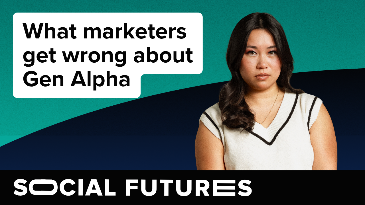
What marketers get wrong about Gen Alpha
Published on June 15, 2026 Reading time 7 minutes - Published on June 15, 2026 Reading time 5 minutesCategories
Australian social media trends: The 2026 trust-shift
Published on June 15, 2026 Reading time 5 minutes - Published on June 12, 2026 Reading time 9 minutesCategories
Social media moderation in 2026: The tools and tactics protecting your brand
Published on June 12, 2026 Reading time 9 minutes


Topic Hubs
- AI Marketing
- AI in Social Media
- Best Times to Post on Social Media
- Business Intelligence
- Competitive Analysis
- Crisis Communications
- Customer Care
- Employee Advocacy
- Facebook Analytics
- Facebook Marketing
- Hashtags
- Influencer Marketing
- Instagram Analytics Tools
- Instagram Marketing
- LinkedIn Marketing
- Reputation Management
- Sentiment Analysis
- Social Media Advertising
- Social Media Analytics
- Social Media Audit
- Social Media Content
- Social Media Customer Service
- Social Media Engagement
- Social Media Listening
- Social Media Management
- Social Media Management Packages for Small Business
- Social Media Marketing
- Social Media Planning
- Social Media ROI
- Social Media Reporting
- Social Media Scheduling
- Social Media Search
- Social Media Statistics
- Social Media for Healthcare
- TikTok Analytics
- TikTok Marketing
- UK Influencers
- X (Twitter) Analytics
- X (Twitter) Marketing
- YouTube Marketing
Build and grow stronger relationships on social