Unlocking insight: the power of data visualization

Written by Jacqueline Zote
Published on October 3, 2023
Reading time 8 minutes

You’re regularly analyzing your social media performance and getting some interesting insights. But how do you communicate those insights to relevant stakeholders? Not everyone’s an analyst who can easily make sense of the data to extract actionable information. That’s where data visualization comes in, helping you make data more understandable for everyone involved.
Data visualization helps transform large data sets (think big data) into something that’s easily processed at a glance. This makes it a crucial part of your social media reporting efforts. In this post, we take a deep dive into what data visualization is all about and what role it plays in your business. Let’s get started.
What is data visualization?
Data visualization is the process of presenting data and information in a visual format. It involves the use of charts, graphs, maps and other visual elements for translating data. These visualizations make it easy to process and understand trends and patterns in a given data set.
What are the advantages and disadvantages of data visualization?
Visualizing data improves understanding and communication across the board. Considering this, it’s hard to imagine that there would be downsides to it. Information visualization can sometimes lead to misunderstandings, so it’s important to consider both the advantages and disadvantages before you delve into it.
Advantages
Enhanced data understanding
Visualized data is easier to understand for people of all skill sets and experience levels. You don’t need to be an analyst to interpret what the data is saying.
Quick identification of patterns and trends
With data visualizations, outliers in data sets are prominently highlighted. This allows you to quickly spot patterns, relationships and trends without having to pore through mountains of data.
Effective communication
As visualized data is easier to understand, there’s a lower risk of confusion and misinterpretation. So you can effectively share information with relevant parties, resulting in improved communication.
Improved decision-making
Visualization quickly translates huge data sets into actionable insights. This makes it easier to decide what to do with your social media data.
Enhanced data-driven storytelling
Data visualization enables effective storytelling with big data. Colors, patterns and other visual elements help people to visualize the story that your data is trying to tell.
Disadvantages
Misinterpretation of visuals
If you’re not careful with how you present the data, the visualization may not effectively convey your message. This leaves more room for people to misinterpret the data and come up with incorrect conclusions.
Overlooking context and details
Sometimes, visualization results in an oversimplification of data. So people draw inexact conclusions because they overlook essential context and details.
Selection bias and distortion
On its own, data visualization leaves interpretation up to the audience. That means each individual applies their own selection bias to understand the data. This muddies the waters, resulting in distorted insights.
Data visualization and big data
Big data refers to huge volumes of data that are too complex to manage using traditional processing tools. This type of data is extremely diverse and arrives at a high velocity, which makes it all the more challenging to analyze.
At the same time, organizations can’t afford to ignore big data. Due to its high volume, high velocity and high variety, it has the potential to generate a wealth of insights using the right analytics tools.
That’s where data visualization comes in, helping you make sense of the trillions of data available at your disposal. Advanced data analytics filter out the noise from big data to extract the most important information. Visualization then helps you tell stories by highlighting those key details. So the two concepts work closely together to drive data-driven decision-making.
What are the 3 C’s of data visualization?
If you’re going to make the most of data visualization, an essential step is to avoid the drawbacks highlighted above. Follow the three C’s of data visualization to clearly and accurately present your data.
Clarity
Be clear about the message you’re conveying with your visualization. What does the data mean? How does it provide value to the audience? Eye-catching graphs may be good to look at, but they’re of no use to stakeholders unless they present important information.
Consistency
It’s easy to misread and misinterpret information when there’s no consistency in your visualization. The same rules and visual styles should apply across the board.
If you’re using one color to represent something in one bar chart, the meaning should be similar across other graphs and charts. For example, if green represents an increase in sales in one chart, it should represent a decline in negative sentiment in another chart.
Context
On its own, data can only tell you so much. It doesn’t tell you if a number is good or bad. For example, if your click-through rate is 4.5%, is that a good number? Adding context to your visualization is crucial for a more comprehensive understanding of the data.
Stakeholders should have something to compare the data against to make better sense of it. In the example above, industry benchmarks and previous quarter numbers can add context.
What are the 5 steps in data visualization?
Keeping the above in mind, here are five steps to build better data visualizations.
Step 1: Be clear on the question
What question does your visualization aim to answer? Have a clear idea of your purpose so you can identify the audience you want to reach and the types of data and analysis you need. You can then understand the types of visualizations that will be most effective for conveying your message. This step serves as the foundation for your visualization efforts.
Step 2: Know your data and start with basic visualizations
Once you’ve laid out your purpose, decide on the data you need to answer your question. Based on this, you’ll understand whether you can collect existing data, or you’ll need to create your own.
Regardless of the type of data, start with basic visualizations to put it all together. This helps you keep things as simple as possible so it’s easier to derive actionable information.
Step 3: Identify messages of the visualization, and generate the most informative indicator
The next step involves cleaning up your data and analyzing it to extract vital insights. What do those numbers mean? Are there any recognizable patterns or trends? What messages can you convey with the data?
This is one of the most important steps as it determines the accuracy and relevance of your data visualizations.
Step 4: Choose the right chart type
The clarity and effectiveness of your visualization heavily depend on the type of chart you use. Decide on the best chart type by understanding the message you want to deliver.
Some charts show patterns in data while others make comparisons between different variables. But more on that in the next section.
Step 5: Direct attention to the key messages
Now it’s time to create your chart. Make sure to include relevant context so it’s easier to interpret the message.
And don’t just lay out numbers. Turn them into actionable insights. If there are any key messages or takeaways, be sure to highlight them so people know what to focus on.
Best types of data visualization
Wondering what types of charts you should use for your visualization? Here are some of the best types of data visualization and their use cases.
- Tables – Data presented in rows and columns. Best for supporting other, more complex types of visualization.
- Charts – Tabular and graphical presentation of data, usually along two axes. Some examples include bar charts, pie charts and Gantt charts. Best for presenting categorical data.

- Graphs – Diagram presenting data with lines, curves, areas, points or segments. Some examples include bullet graphs, line graphs, scatterplots and network graphs. Best for spotting correlations or deviations.

- Maps – Data presented in map form. Some examples include heat maps, treemaps and geographical maps. Best for demonstrating hierarchical relationships and location-specific data.

- Infographics – A combination of words and visuals that represent data. Best for adding context and additional details.
Best examples of data visualization
Not sure what a great data visualization should look like? Check out some of these best examples to inspire you.
London Selfie Demographics
Selfiecity put together the following interesting data visualization of selfie demographics in London. Part of a larger project studying selfies of the world, the visualization below shows a chart comparing London selfies. It compares the number of selfies taken by men vs. women across different age ranges. There are highlights of key findings on the left-hand panel for ease of understanding.

Image Source: Selfiecity
Corruption Perception Index
Transparency.org developed an interactive map showcasing the global Corruption Perception Index. If you hover over each country on the map, you get an overview of its CPI score and how it has changed since the last year. Clicking on the country gives you a detailed report outlining how the score has changed over time.

Image Source: Transparency.org
The World’s Population at 8 Billion
In 2022, the world’s population reached 8 billion. Visual Capitalist presented the data using the following visualization. Lines separate countries and colors separate continents. It’s a simple yet comprehensive way to visualize the info for everyone to understand.

Image Source: Visual Capitalist
Data visualization tools and software
The best way to clearly and accurately visualize your data is by using the right visualization tools and software. This may include platforms with built-in analytics that provide visualized data reports. It may also include software designed specifically for data visualization. Here are some options you should consider.
Sprout Social
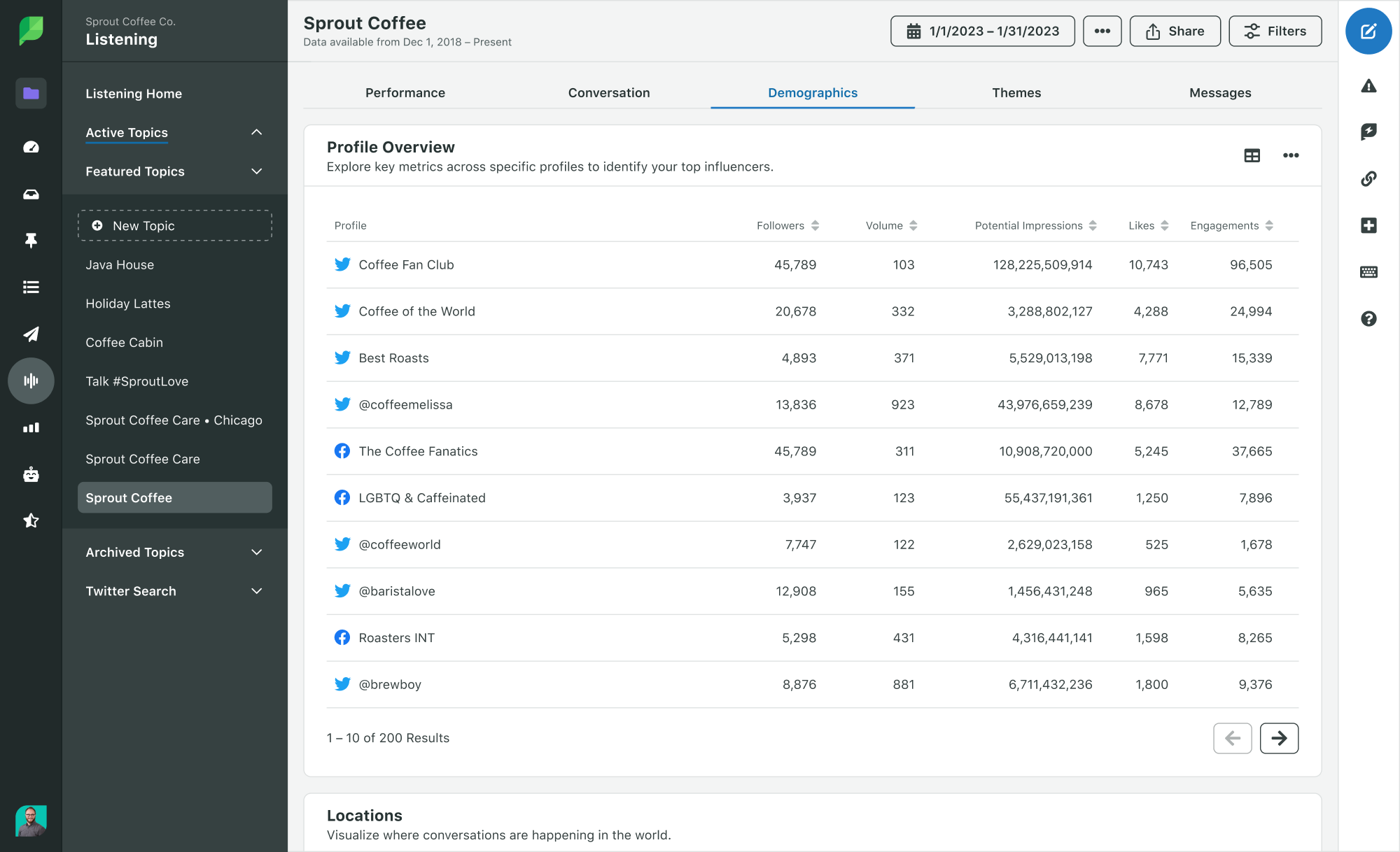
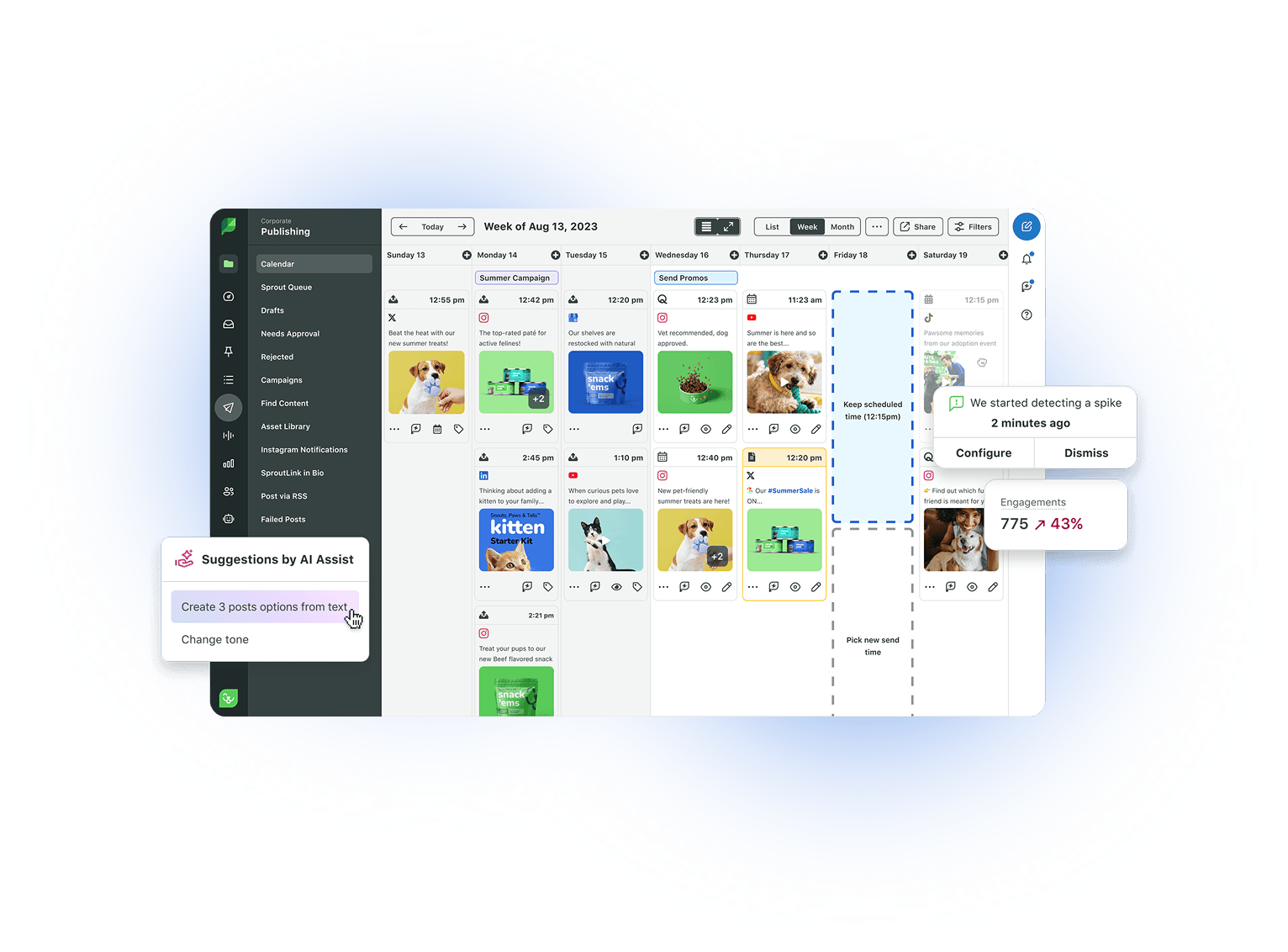
Sprout Social is an all-in-one social media management tool with robust visualization capabilities. The built-in analytics automatically measure your performance across leading social media platforms. The platform then presents the data in a visual format to simplify your data analytics. It uses a combination of graphs, charts, tables and maps to create captivating visualizations of your performance.
Sprout lets you build a wide variety of shareable data visualizations to support your social media reporting. This includes visualizations for your overall account performance and profile activity. You can create team-specific reports with visualizations presenting metrics relevant to each team. It even lets you break down reports to track specific types of performance such as engagement and productivity.

Tableau
Tableau is a visual analytics platform for creating actionable and easy-to-understand data visualizations. It lets you unlock comprehensive insights by connecting to integrated data from any source.
The platform processes this data to deliver predictions and recommendations using Einstein AI. This minimizes the need to write your own algorithms, which streamlines your data analytics process. You can then build visualizations in just a few clicks using the drag-and-drop editor.

Image Source: Tableau
Google Charts
Google Charts is a set of tools for building interactive charts to display live data on your site. Choose from different chart options that best fit the data you want to present. Then customize existing designs to visually match your website. Google Charts lets you connect to your data in real time so you can present dynamic data to site visitors.

Image Source: Google Charts
Additional resources
Interested in learning more about data visualization? Check out the following resources to brush up on your visualization skills.
- Sprout’s blog post on data visualization for marketers
- Coursera’s Data Visualization with Tableau Specialization
- Beautiful Visualization: Looking at Data through the Eyes of Experts
Making data talk with visualization
Visualization is a powerful way to translate your data into a message everyone can understand. At the same time, it’s important to present the data clearly and consistently to minimize the risk of misinterpretation. This helps you get your message across more effectively to turn data into action.
Make the most of Sprout’s Social Media Analytics tools to turn complex social performance data into visuals. Get a comprehensive look at how your social profiles and content are performing. Then put these visualizations together into actionable reports to share with your team.
Share