Twitter Cards: Everything you need to know

There are more than 330 million monthly active users on Twitter (rebranded as “X”).
If that number isn’t significant enough to make your marketing team’s mouths water – how about the fact that 51% of Twitter users earn more than $50,000 per year? That’s some real purchasing power.
Twitter is great at driving more qualified traffic to your blog, product page or website.
The only caveat?
Sometimes you need more than 280 characters to capture a conversion.
Fortunately, there is a solution. Twitter Cards give you the power to convey plenty of useful and engaging information to your followers, without breaking the character limit.
Here’s everything you need to know about using Twitter cards to drive leads to your website in 2019 and beyond.
What are Twitter Cards?
Twitter cards have been around for quite a while now, but they’re far from outdated solutions.
Twitter cards were designed back when Twitter only allowed people to tweet 140 characters at a time. Back then, the cards were a crucial way of going beyond the restrictive character limit. Today, the cards still serve the same purpose for some. Twitter says that even after updating their limit to 280 characters, many users still hit the threshold.
Beyond giving you more space to engage your followers, Twitter cards are also a visual component on your news stream, that help you to stand out from an avalanche of wordy updates. Using Twitter cards:
- Gives you more visibility on Twitter
- Helps you to earn followers through immersive interactions
- Makes your Tweets more attractive and “clickable.”
- Increases traffic to your website
- Encourages conversions from customers
It’s a well-known fact that Tweets with media attachments get greater exposure than the average tweet. Tweets with images get up to a 55% increase in leads and 41% increase in retweets. It only makes sense that Twitter cards would have a similar impact.
Sometimes it’s easier to digest information by talking through it together.
Join us all day on 12/5 as we host live chats for all 9 #SproutSessions!
Check out the full schedule: https://t.co/mWIynRklhN pic.twitter.com/d7GYB6Jmsj— Sprout Social (@SproutSocial) November 20, 2018
The question is, which cards should you use?
There are currently four card types available. Though Twitter did experiment with options like lead generation cards, they decided to refine your choices again in the last couple of years after few people used the new formats. Your options today are:
- Summary Card
- Summary Card with Large Image
- App Card
- Player Card
1. Summary Card
The Summary Card does what it says on the tin – it refines your web content into a snapshot image with a thumbnail, title and description. Users can even see the URL of your website displayed at the bottom of the card. The idea is to give your viewers a preview of your content before they click through to your site. If you use Twitter to accelerate your blog traffic, this could be an excellent option for you.
Title: 70 characters
Description: 200 characters
Image: at least 120×120 pixels and no more than 1MB
Ways to use the Summary Card
- Show off your latest deal on your eCommerce store
- Promote your new blog post or article
- Highlight your brand’s news of the week
- Demonstrate your most popular product of the month
You can also use your Summary Cards to give a shout-out to the companies that mention your brand on their website:
We're beyond excited to see our #SproutPartner @MoonsailNorth sharing their experience from the #SproutPartnerSummit! Read on to see the takeaways you can apply to your business: https://t.co/ZZynavUcF3
— Sprout Social (@SproutSocial) November 20, 2018
How to add this Twitter Card to your site
To add it to your website, you need to paste this code into your webpage HTML:
<meta name=”twitter:card” content=”summary” />
<meta name=”twitter:site” content=”@yoursite” />
<meta name=”twitter:title” content=”Your Title” />
<meta name=”twitter:description” content=”Your description.” />
<meta name=”twitter:image” content=”https://where-your-image-is-hosted/name.jpg” />
2. Summary Card with Large Image
From a functional perspective, there’s not too much difference between this card and the typical Summary Card. The biggest difference is the size of the image. Companies use Twitter cards with the large summary image when they want to capture user attention.
Users are posting hundreds of millions of Tweets per day on Twitter. A large image is a great way to stand out.
Title: 70 characters
Description: 200 characters
Image: at least 280 x 150 pixels and no more than 1MB
Ways to use the Summary Card with Large Image
Summary Cards with Large Image are ideal when you want to make your content stand out. Think about whether your post needs a visual aspect to make it compelling. If all you need is a thumbnail of your logo, then the standard Summary Card will be fine. Alternatively, if you’re demonstrating a new line of products, showing a snapshot of an infographic, or highlighting an important statistic, a large image is sure to earn attention.
The "always on" nature of social puts pressure on businesses to commit to transparency in advance, in multiple formats and in real time. #BrandsGetReal https://t.co/efS7GZvras pic.twitter.com/4LKnSuwWxu
— Sprout Social (@SproutSocial) August 15, 2018
How to add this Twitter Card to your site
Add this HTML code to set up this type of Twitter Cards:
<meta name=”twitter:card” content=”summary_large_image”>
<meta name=”twitter:site” content=”@yourwebsite”>
<meta name=”twitter:creator” content=”@yourtwitterhandle”>
<meta name=”twitter:title” content=”your title”>
<meta name=”twitter:description” content=”your description.”>
<meta name=”twitter:image” content=”https://where-your-image-is-hosted/name.jpg">
3. App Card
App Cards are the solution that Twitter uses to sell mobile app advertisements to business users. If you’re focused on giving your customers an all-encompassing mobile experience, all you need is a few lines of code.
App Cards show a preview of your app icon, a description and even the price or rating of your content. Since Twitter users go to the platform to discover new things, it’s a great platform for showing off your latest apps.
Title: pulled from app ID
Description: 200 characters
Image: app logo pulled from app ID—image should be at least 800 x 320 pixels and can be JPG, JPEG, PNG or GIF format
Ways to use the App Card
The most obvious way to use your Twitter app cards is to highlight your exciting new app. Remember, you’ll need your app to be publicly available in the app store for Twitter to access its information. Additionally, the image and title for your app card will be pulled directly from the store, so make sure everything looks great before you publish your cards!
How to add This Twitter Card to your site
Here is the code you should enter:
<meta name=”twitter:card” content=”app”>
<meta name=”twitter:site” content=”@yourwebsite”>
<meta name=”twitter:description” content=”your description”>
<meta name=”twitter:app:country” content=”your country like US”>
<meta name=”twitter:app:name:iphone” content=”your iphone app name”>
<meta name=”twitter:app:id:iphone” content=”your iphone app ID”>
<meta name=”twitter:app:url:iphone” content=”your iphone app URL”>
<meta name=”twitter:app:name:ipad” content=”your ipad app name”>
<meta name=”twitter:app:id:ipad” content=”your ipad app ID”>
<meta name=”twitter:app:url:ipad” content=”your ipad app URL”>
<meta name=”twitter:app:name:googleplay” content=”your googleplay app name”>
<meta name=”twitter:app:id:googleplay” content=”your googleplay app ID”>
4. Player Card
Multi-media content is taking over on every social platform.
In 2017, Twitter live-streamed more than 830 events to a global audience. As customers continue to flock to video content, a Player Card is your chance to take advantage of this exciting format. Player Cards offer plenty of exciting ways to interact with your customers. However, setting up a Player Card can be a little complex, so be sure your media matches the specifications.
Video: H.264, Baseline Profile (BP), level 3.0, video dimensions up to 640 x 480 pixels at 30 frames per second (fps)
Audio: AAC, Low Complexity profile
Ways to use the App Card
Player Cards are an excellent way to engage your audience. Use them for:
- Exciting snippets from your latest podcasts
- Clips of brand videos
- Product videos
- Insights into your brand events
- Highlighting Q&A sessions
Check out some highlights from our debate on Tuesday about how companies should think about their employees' use of social media. Featuring @holly, @JemimaG and @Ankaman616
And carry on the conversation in our community forum: https://t.co/FHPy0F6rPm pic.twitter.com/7OQILfLFwp
— Monzo 🏦 (@monzo) September 27, 2018
How to add this Twitter Card to your site
With multiple types of media supported, your best option to add a Player Card to your site is to follow the instructions on the Twitter Developer page. Twitter offers a “getting started” bundle to help make sure that your cards work properly, but it’s essential to test your URL anyway, just in case.
How to set up Twitter Cards
There’s a lot of confusion around how to set up Twitter Cards and manipulate them on your site. Unlike LinkedIn and Facebook, where you can edit what the post pulls from your website before publishing, Twitter cards are controlled by html placed on the backend of your website. Fortunately, there are plenty of ways that to access and test Twitter Cards for your campaigns.
On a self-hosted WordPress site, the easiest option is to install a plugin that allows you to add code to your site more easily. The Yoast SEO plugin or JM Twitter Cards plugin are two popular options because they require no coding skills.
Alternatively, visit the Twitter Card Page hosted by Twitter and pick the card you’re interested in using. Here, you can set up all the individual aspects of your card and get your embed code to add to your site.
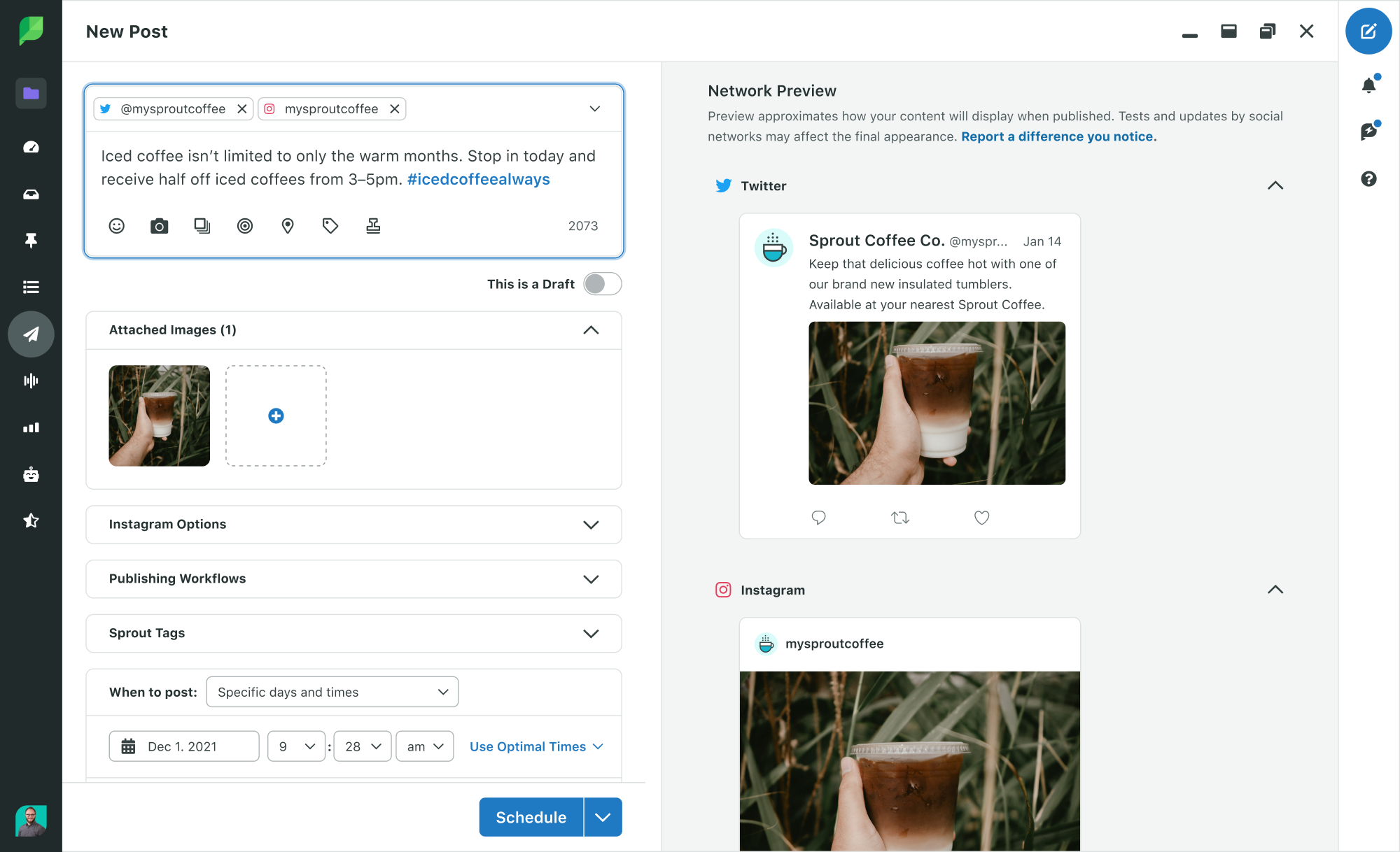
Since the appearance of your Twitter Cards is crucial to your brand reputation, we recommend using Sprout Social to see your Twitter card content before you publish it. You can click Preview in the Compose window when posting a URL with markup for a Twitter Card, an ensure your post looks just as you expect. Previewing your Twitter Cards in advance ensures that you’re not taking risks with your social strategy and that you’re having the right impact on your audience.

Using the Twitter Cards Validator
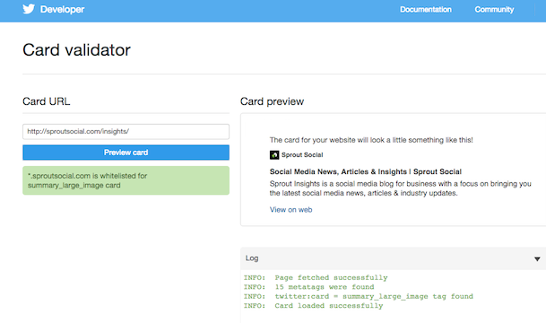
Once you’ve figured out how to set up Twitter Cards for your campaign, it’s crucial to make sure that they work correctly. Once your tags are live, use the Twitter Card Validator to make sure everything is working as it should be.
All you need to do is copy the URL of your page into the validator application. If everything is working, you’ll see your card preview, along with a few details on how many meta tags you have installed.

How to measure Twitter Cards with Twitter Analytics
With your Twitter Cards successfully up and running, it’s time to optimize your campaigns.
Twitter Cards Analytics are available through Twitter, to show you exactly what kind of traction you’re getting from each of your cards. The insights available include:
- Snapshot: A quick look at how your cards and tweets are driving shares, traffic and installs. Click on a circle to find out more about a specific conversion.
- Change over time: A graph showing the impressions, clicks, and tweets of your Snapshot in a 25-day rolling image to demonstrate your growth.
- Card types: A chat for benchmarking your Twitter cards by comparing them to overall standards.
- Links: See which of your content is performing best. Your top-performing posts by clicks and impressions will appear at the top of the page.
- Influencers: Which posts had the biggest impact on your clicks and impressions? This space will show you your top influencers.
- Tweets: Which of your posts lead the most customers back to your website? This space shows successful tweets from outside of your profile too.
- Sources: Where are the posts that include one of your cards coming from?
Sprout Social can also help you take your analytics to the next level on Twitter. You’ll get a comprehensive view of your Twitter analytics that you can compare to your Twitter Cards Analytics and get a sense of how your posts with Cards are performing within your overall strategy.
How to update your Twitter Cards
Just because Twitter Cards aren’t the newest social feature, doesn’t mean they’re not relevant. For companies trying to drive attention and conversions to their website, Twitter Cards are still one of the best ways to stand out on your social feed.
Here are a few tips to consider as you add Twitter Cards to your future strategies.
1. Give people a reason to click
To reach audiences whether they’re browsing on mobile or desktop, set your cards up to capture audience attention. One way to do this is to pin your latest card to the top of your timeline. That way, whenever someone comes to your profile, they’ll see the card.
Alternatively, focus on making your copy as compelling as possible, so that users can’t help but click. For instance, look at this short but persuasive tweet from Etsy, featuring an image that speaks for itself:
Succulents + cookies = 🙌. https://t.co/fvcGecam4G pic.twitter.com/rLqfiS1QMX
— Etsy (@Etsy) November 15, 2018
2. Use stunning images
Speaking of impressive images, Twitter is great at adjusting your images to fit your post. However, if you let Twitter do all the formatting for you, then you risk your pictures appearing pixelated or stretched. Spending a little extra time on your profile’s appearance will help your brand reputation and boost your chances of conversions.
Remember, Tweets with images get 18% more clicks and 150% more retweets than tweets without. Treat your Twitter cards more like your Instagram feed and make sure that your pictures are compelling enough to drive people to your site.
3. Don’t forget to hack your hashtags
Twitter is famous for making the #hashtag a crucial component of social media. With that in mind, don’t forget to use hashtags when you’re publishing your Twitter cards. Use your tags to launch a specific campaign, or to make sure that people can find your posts when they’re looking for specific keywords.
What can five years and 1,127 data points tell you about the future of social media? Here's what @khkristin found: https://t.co/BJ43ICTalI #ThinkActAdapt
— Sprout Social (@SproutSocial) November 21, 2018
Remember, solutions like Sprout Listening help you to track which hashtags are getting the most attention on Twitter. Pay attention to the tags your customers are using and use the same keywords to connect with them.
4. Keep your posts short and sweet
Finally, with Twitter cards, your image, video or audio snippet should do most of the talking on your brand’s behalf. That means that you don’t have to use the full 280-character limit explaining what your cards are all about.
The best Twitter cards examples work because they use a short and compelling intro to draw attention to the content below and convince customers to click. Some companies benefit from making the intro text on their cards deliberately vague so that their followers’ curiosity compels them to click:
We can't wait! Sign up now: https://t.co/bENdpPfqgW #SproutSessions https://t.co/57c8DkhoFj
— Sprout Social (@SproutSocial) November 19, 2018
Are you using Twitter Cards yet?
When used carefully, Twitter Cards boost visibility, enhance your social media performance and improve your online reputation.
All you need is the right strategy for adding these cards to your social media deck.
Speak to your team about your campaign goals and make sure that you’re using the right card type for each post. Be open to playing around with different card types and above all else – make sure you track your performance. The more you learn about your Twitter card results, the better your tweets become.
Is it time you unlocked the real power of your Twitter campaign? Click here to start turning Tweets into conversions.
Use of Twitter nomenclature across Sprout refers to newly rebranded X platform and related terminology.


Share